Sep, 2018
Having totally reconfigured and redesigned our client’s home, we were asked to step in to detail and realise the very particular design for their dream kitchen.
Henry Miller-Robinson


Our client wanted a kitchen that was wonderful to cook in and to entertain in. It should be as comfortable for two people or for their family of five and have the flexibility to accommodate large dinner parties.

The husband is a passionate cook with a profound interest in and knowledge of the performance of every top-ranking professional cooking appliance.


The wife has little interest in cooking, but was determined not to be intimidated by the kitchen and for the room to remain the heart of the home.

The space needed to include an important but not too dominant kitchen zone; a dedicated tea and coffee area; a large pantry; a desk area to include space for printers and pigeon holes for each family member’s post. They also wanted a television and comfortable seating for two.

We continued to draw up ideas until both were truly satisfied.
Katie Glaister


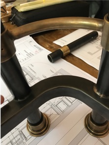
Whilst wishing to limit the palette of materials, we chose to combine blackened steel and antique bronze with hand painted cabinetry and the incorporation of very refined burr walnut on the island. The result is a timeless design, where cooking and formal entertaining go hand in hand.


The kitchen had to work perfectly for the creation of technically sophisticated dishes. We incorporated restaurant-quality extraction and cooking appliances from Bora and Electrolux Grand Cuisine.
This was a technically complicated task, as each appliance differed in terms of power requirement, dimension and finish. We needed to find a very precise design solution in order to integrate these variances – seamlessly.
Katie Glaister
The centre-piece is a 3.2m long island. It accommodates the range cooker which K & H Design developed in order to incorporate the hand picked selection of appliances, all set into a blackened steel front panel. On the elevation facing the dining table, functionality is enhanced by aesthetic with a series of book-matched burr walnut cabinets trimmed in antique bronze.


We didn’t want the island to feel heavy and monolithic.
Henry Miller-Robison
Each end is open and the whole piece is raised off the floor. The island feels more like a smart piece of furniture than a functional kitchen island.


We so enjoyed designing the pantry with its floor to ceiling door incorporating fluted glass to transfer light but keep food preparation hidden. The floor tiles are reclaimed encaustic tiles from Spain, the ceiling is finished in New York tin tiles, specially finished to create an aged effect whilst remaining hygienic. With input from our client’s children we arranged for important foodie words to be sign-written onto the glass vintage pendant lights.


There is a lot of joinery in this room, but with the inclusion of light wool floor-to-ceiling curtains, gossamer thin plaster cone lights, a deep pile rug and upholstered bar stools and dining chairs the room is peaceful and has proven a joy to be in, by day and by night.


